Global navigation project
My Role
Working with UX Researcher – user interviews
Stakeholder interviews
Competitor analysis
Workshops
Prototyping
User Interface Design
Iconography
Global Style Guide
QA with dev
Working with
UX Researcher
UX Lead
Stakeholders
Project Manager
Dev
Tools
Sketch
Marvel
Invision
Zeplin
Duration
6 months

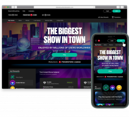
Responsive header
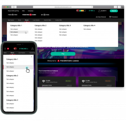
Fat nav navigation
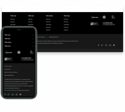
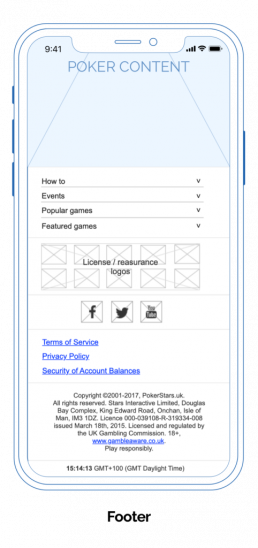
Responsive footer
Discovery
Problem statement
PokerStars has 3 main brands (Poker, Casino and Sports) on its site with 3 differing navigation styles. This is contributing to inconsistency, navigation usability issues, mistrust, and frustration for customers. Mobile web navigation is also not easily discoverable.
The business would like to introduce a widget area for the Stars Rewards Loyalty program, which cannot be properly accommodated in the existing header due to lack of space and inconsistent experiences.
The business would like increase new account creations by 15% and increase number of people making deposits by 15%.
Discovery
Discovery
Formulating assumptions about usability pain points
A UX audit was carried out on the existing navigation to review areas of improvements that may be causing headaches to users and affecting business goals.
The aim was to pinpoint problem areas and reveal which parts of navigation were causing pain points or hindering conversion rates.
It was also used to detect performance issues affecting user task completion and reducing user satisfaction.
Methodologies used to gather insights
Research
Research
Visual brand assessment of UI including:
Evaluating all qualitative and quantitive data
We analysed data for insights and to establish success metrics on how global navigation is being used and where users have difficulty.
To make sense of the information Card sorting was used to help design and evaluate information architecture for the navigation.
Feedback insights were organised into categories and ranked according to severity.
Usability studies key findings
- Inconsistent and fragmented experience on Poker, Casino and Sports
- Discoverability issues on mobile and desktop
- Usability issues
- Hard to navigate between products
- Dated look and feel
- Difficulty in being able to make a simple deposit
- Difficulty in creating account
Insights were presented to stakeholders with series of actionable recommendations
Measurable success metrics
- Increase new account creations by 15%
- Increase new users completing task of making first time deposits by 15%
- Increase NPS net promoter score from 6/10 to increase user satisfaction
RESEARCH
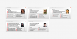
Personas
We identified 5 different types of player personas to design for:
- Peter the Player
- Eva the everyday escapist
- Mike the moonlighter
- Emma the relaxation gambler
- Ravid the compliment gambler
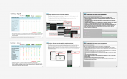
Competitor analysis
Competitive analysis was performed on competitors from related and unrelated industries. We reviewed the “Deposit” and “Create Account” journeys and benchmarked them against competitors, identifying focus areas for improvement.
User stories
A list of “must have” user stories were compiled guided by input from product owners and key stakeholders.
A customer journey maps was built to understand customer needs and expectations at each step in performing different tasks. The journey map provided a holistic, visual and tangible journey map as part of a comprehensive customer experience.
Ideation
We used ideation sessions to solve a a series of navigational design challenges.
Time limited sessions
Focusing on sparking innovation, we focused on lateral thinking, inviting stakeholders from all over the business to help generate quantity, rather than quality of ideas.
We focused on the users, rather than fixating on what what technically viable.
Example questions:
“How might we increase our new account creations?”
“How might we make making a deposit easier?”
“How might we make content more discoverable?”
“How might we make navigating between product verticals easier”
“How might we personalise the user experience?”
“How might we integrate the Stars Reward widget?”
“How might we make promotions more prominent?”
Design
Global header navigation sitemap
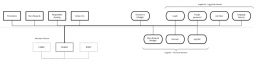
Global footer navigation
Design
Wireframing, prototyping and user testing
Complex site information was broken down into logical categories and hierarchies. The biggest challenge presenting the most important information first to users in a clear and coherent way whilst reducing clutter.
Research suggested the majority of users scan to quickly find what they are looking for. This had a big influence on the design – such as using iconography to make elements standout.
Wireframes concepts were designed, tested and iterated. The live prototype in Invision was conducted in gorilla testing sessions at the Hippodrome Casino in Leicester Square.
Further user testing was conducted with UserZoom. We analysed results, iterated designs and tested again. Technical feasibility was reviewed with dev and then moved to hi-fi UI design.
Design
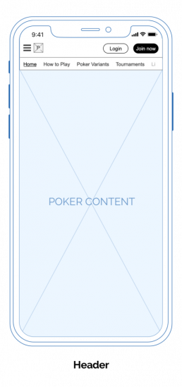
The solution
Building hierarchies of information
Scalable & future proof design
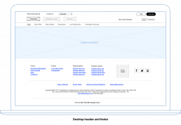
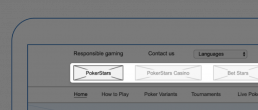
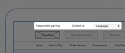
Poker, Casino and Sports logos have been placed top left and equally sized vertically to allow seamless navigation and switching between brands. This allows business to cross-sell its different products.
Each brand now has a consistent, unified navigation experience to increase usability. White space has been added to accommodate additional brands.
Promoting responsible gambling & reducing calls to customer service
“Responsible Gaming” is given a large emphasis from business and regulatory requirements in the top left, making it highly visible and accessible from all pages. It was given a text link hierarchy not to distract from nearby content, but still remain prominent.
The design helped reduce calls to customer service by linking to an FAQ help centre section and only showing the phone number when customers drill down into page information.
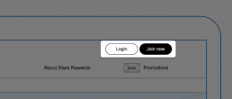
Increasing sign ups
Easily findable “Login” and “Join now” buttons to the top right of the design follows conventional UI patterns, improving discoverability.
The button uses strong visual cues to make it stand out, including high contrast colour, size and ample whitespace. The high prominence increases visibility, click-throughs and performed very well in testing.

Quickly finding rewards and promotion offers
Research indicated customers wanted to quickly locate promotions and rewards. The “Stars Rewards” and “Promotions” offers have their own highly prominent section. They are accompanied by linear icons to add emphasis and aid visual scanning for information.
Solving discoverability problems
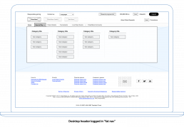
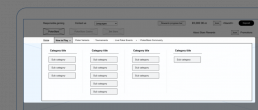
One of the biggest complexities of this project was accommodating important information only relevant to specific sections of the site, but allowing it to be easily discoverable. We broke down sections into logical categories using parent and child sub-categories.
To make the navigation simple, discoverable, and accessible, we prototyped a “fat-nav” sub-navigation, which tested very well. It made valuable use of screen real estate, and was hidden when not on focus. This allowed a stripped back, clean and simple navigation and added usability.
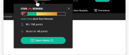
Introducing Stars Rewards widget
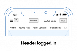
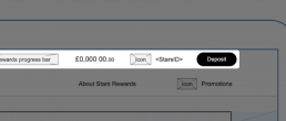
Logging in provides the customer with a different view where “Deposit” takes prime location in place of the “Login” buttons. Its size, positioning, and high contrast colour add a strong visual hierarchy, making it the top action in the new navigation.
The Stars Rewards loyalty widget has been placed in a highly visible location and adjusts to responsive screen sizes. Customers can also access their account, account balance and view their username from this view.
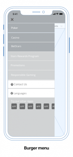
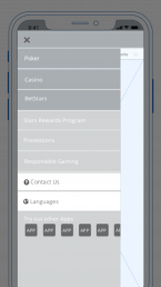
Making mobile content discoverable
The responsive mobile navigation now offers the same discoverability as the full desktop site across any device size. The new navigation adapts responsively and is made up of a series of carefully considered hierarchies of information.
Design
Why I decided to do a UI brand re-design
- To push the guidelines, elevate business, build brand recognition and customer loyalty
- Showcase added value so customers develop an emotional connection
- To attract customers that share similar brand values
- A user friendly interface with easy navigation increases discoverability, user satisfaction, and decreases search time
- Fulfils user needs in fast and efficient way
- Strong brand increases sales volume + customer loyalty base
- Minimise cost and resources
My design approach
I approached the Visual design aesthetic strategically by refining colours, fonts, and components making sure the UI did not distract from the content on the page or function.
I took a minimalist approach, removing clutter, borders and increasing whitespace where possible.
A series of visual UI prototype concepts were produced in Sketch and InVision and continually iterated through rounds of user testing including 5 seconds tests, A/B and first click tests.
Design lead by research
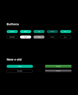
Research showed using a high contrast colour (green) to the main (red) PokerStars brand colours increased click through rate by 22% compared to the old red buttons.
High contrast buttons to improve discoverability
To modernise the brand in line with latest trends, the CTA's dated gradients were removed. The colour was chosen by picking a green on the opposite side of the colour wheel to PokerStars Red with the same hue to ensure they worked in harmony. This generated the strongest contrast and gave the buttons a clean, modern, on trend feel.
De-cluttering the UI with clear hierarchies
Stripping back the UI with a minimalist approach with removal of borders, gradients, with clear hierarchies of information. Increasing white space to reduce cognitive overload. Use on icons alongside text to aid discoverable, usability and easy navigation.
Mobile first
Special attention was paid to designing an easy to use mobile first design for easy navigation. Making sure buttons, menus and interactions were suitably sized and spaced for increased usability. Discoverability of information was key to the success of this project.
Consistency is key
I started building a style guide to ensure consistency across all components for design teams and dev to use. Customers expect a consistent experience across brands without the annoyance of having to re-learn behaviours. It makes finding what they are looking for easier and minimises confusion.
CTA size and placement
Influencing size and positioning of “Sign up” and “Deposit” buttons - using high contrast colours to increase prominence and visibility.
Friendly and calming
CTA’s use calming sentence case lettering, whilst rounded corners make it friendly and easy on the eye – similar to strong brands like Spotify and PayPal.
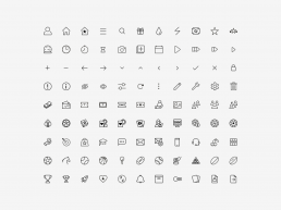
Iconography set
To introduce a level of consistency across all brands, I designed a new iconography set 24px x24px to reflect PokerStars premium brand style. The style was created by using a one pixel linear stroke style, stripping away clutter to add a premium look and feel. The iconography aids users scanning for items, enabling them to more efficiently distinguish items in the navigation.
Grids
Total width: 320px
Columns: 4
Columns width: 64
Gutter width:14
Total width: 768px
Columns: 8
Columns width: 68
Gutter width: 30
Total width: 1440px
Columns: 12
Columns width: 76
Gutter width: 30
Creating a hierarchy within the header
Header logos design iterations and decisions
Red underline used to indicate Casino product selected, but user testing reported confusion on which product is selected
We tested removing colour from unfocused logos, but the white text still draws the eye
A further iteration removed colour from logo and text opacity reduced to 80%, but red underline felt too heavy
The 100% opacity red and white signifying the selected brand and naturally drawing the eye, performed well in user testing. For unfocused states – greying out brand logos and using an 80% opacity on text, users reported no confusion to which product they were browsing
Font choice

A B C D E F G H I J K L M N O P Q R S T U V W X Y Z
a b c d e f g h i k l m n o p q r s t u v w x y z
After observing users squinting with the old Roboto Condensed font during testing, I chose highly readable font Roboto for its legibility, match to the brand, free open source implementation and licensing. It tested well, aids discoverability and enables customers to scan quickly for information.
Colour palette

stars-black
#000000
RGB 0 0 0

stars-red
#d70022
RGB 216 0 34

stars-green
#02BD9C
RGB 2 189 156

stars-white
#000000
RGB 255 255 255
Header
Header fatnav
Footer
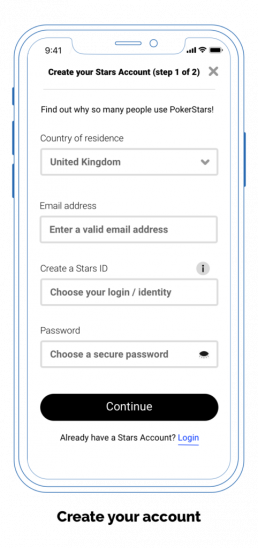
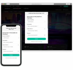
Re-skinning create account dialog
Decluttering the UI
My approach was led by stripping out any unnecessary UI elements to declutter the interface, removing borders and adding white space where possible. This helped simplify the UI, introducing a clean, flat, modern and simplified user interface. The outcome reflected the brand values of a premium, desirable and trustworthy brand.
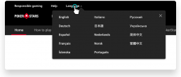
Language selection
The website is released in over 60 countries worldwide. This meant one of the main challenges was designing for the localised translations and worst-case scenarios. This meant testing languages in Greek, German and Russian to check the header could accommodate text translations.
Stars Rewards loyalty program
The Stars Rewards widget was re-skinned in the new UI style. Re-designing the entire component was out of scope for this project.
Deliver
Deliver
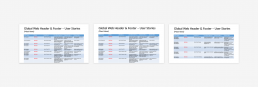
Global Style Guide
I uploaded screen specs and designed a style guide for dev in Zeplin. This project formed the basis for my next project, which was to build the Stars Group Global Style Guide which would be used as the one source of truth to improve consistency between the PokerStars brands. It brought about an institutional change in the company where Zeplin would be used to style components in React and used across all platforms.
Evaluate
Measuring OKR objectives and key results
Actions were put in place to monitor, measure and quantify success with google analytics, new account creations, revenue increase, monthly active users and time spent on site.
Increasing Account creations by 33%
The business wanted to increase Account Creations by 15%. After deployment analytics showed a 33% increase in Account Creations compared to the year before.
26% increase in Deposits
The business wanted to increase revenue by increasing Deposits by 15%. Analytics showed a 26% increase in Deposits compared to the previous year, which vastly exceeded expectations.
9/10 Net Promoter Score (NPS)
Using Usabilla software and surveys on our live site to measure the Net Promoter Score (NPS) we scored a 9 out of 10.
The site continues to be evaluated, with the UX CXD department working closely with customer services to identify areas of improvement.
Learnings
Importance of cross brand consistency
Customers expect a consistent experience across brands without having to re-learn behaviours. It makes finding what they are looking for easier and minimises confusion.
Don’t hide contact information
Though the business would like to decrease enquiries to customer support, it was reported it was one of the most searched for pieces of information. This helped form the basis for a future Customer Support help center and FAQ section to help customers self-serve their enquiries.
Psychology of reinforcing trust
During initial user interviews customers reported online security as a major factor on whether they would interact with a website. A well branded, consistent UI with trust logos and links to responsible gaming helped improve this.
High contrast CTAs
Research showed that by previously changing our CTA buttons from the main red brand colour to a high contrast green improved click through rates by up to 20%. This theme was continued and modernised for the next generation of PokerStars users with the introduction of a new flat green to help increase account creations.
People scan for information
Our eye tracking software showed people quickly scan for information and when icons were placed along text, it helped them visually recognise what they were looking for much faster.
Mobile discoverability
Most people use devices on the go and expect the same experience on a mobile as desktop site. They want to quickly find what they are looking or they’ll drop off and go to a competitor site.