Project
Designing a design system
When I started at PokerStars there was no style guide for our products. The design experience was wildly inconsistent, interaction patterns varied and usability was incredibly fragmented across web, apps and desktop clients.
6 months after joining the customer experience team, I started working on creating a design system in my down time to improve consistency.
Single source of truth
It would become the one source of truth for designers and development and holy bible for PokerStars suite of products.
Global impact
It made a global impact to design delivery of the organisation and one of the proudest accomplishments of my career to date.
Design system delivered in Zeplin

PokerStars is the largest online poker site in the world, with over two thirds of the total online market with over 1 billion page views per year.
Project Goals
Creating a design language and library of reusable components
The goal was to create a design language and pattern library of reusable components that would increase the efficiency and consistency of the design team and dev.
One source of truth = less arguments
Questioning why and iteratively testing components, it would reduce time to market and help to smooth arguments with stakeholders.
Atomic approach
Taking inspiration from Brad Frost’s atomic design, I worked with a handful of UX researchers and designers to incorporate as many learnings into the product and present our guiding principles.
Including dev in regular updates proved to be invaluable, and earned strong buy-in form their side from an early stage.
Strategically aligning to company goals
Aligning to PokerStars business goals would help in providing buy-in from stakeholders and;
Long term benefits
Provide long term benefits to product design and the development roadmap
Improve
Improve information architecture, accessibility, discoverability, and usability.
Consistency
Improve ease of use, improve clarity, consistency and reduce complexity
Unify
Unify our products
The process
Creating guidelines for a usable, scalable, accessible and consistent design system
The design system project was approached strategically to create a usable set of guiding design principles.
Understanding not only the what, but the why, behind the principles of the design system was critical to creating an exceptional user experience.
Creating a living, breathing system that’s usable, scalable, accessible, consistent and maintainable set the standards for success in the long-term.
Setting clear philosophies for designers
The UI for the pattern library was not created in a linear process.
In truth, the pattern library would count for nothing unless it was guided by a clear set of design principles and direction on approach for tone of voice, visual language, motion and product vision.
Setting out a clear philosophy helped to anchor decisions as the UI pattern library grew.
Establishing the workflow

Establishing a new set of tools (Sketch, Zeplin) with powerful plugins and integrations, made hand-offs to developers run with hyper efficiency. Having a central repository for developers to view pixel perfect assets and code vastly improved efficiency.
Introducing a new way of working within the organisation also had a huge impact – previously, designers had to communicate with dev through a BA (Business analyst) usually through a Jira request in multiple time zones. This added delays, confusion where things were lost in translation and added multiple roadblocks to the process.
Streamlining the design process to allow designers to speak directly with dev had a massive impact raising, productivity and overall consistency of shipped products.
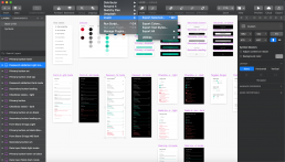
Above – exporting components from Sketch to Zeplin
Core elements baseline inventory
An inventory of the legacy and required components were mapped out using an online tool called Airtable.
This enabled strategic planning of components in design sprints and allowed us to track the status in terms of documenting the design, reviewing, testing and approvals.
New components had to meet certain requirements, be scalable at modular level and meet WCAG 2.0 accessibility standards.
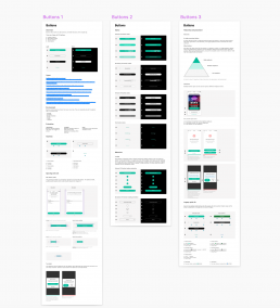
Above – inventory of required components mapped out in Airtable
Documentation of components
A UI pattern library template was set up in Sketch to document the components look, functionality and usage examples taking inspiration from Google’s Material Design.
Design principles started out as concepts that were initially documented, reviewed and iterated collaboratively.
Once completed, a UX copywriter came in to smooth over the overall tonality of the documentation.
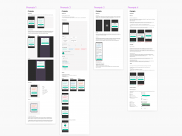
Above – a screenshot of how the design system template was setup for prompts
Architecting tokens
The token architecture was formulated using a straightforward decision-making, grouping, ordering and classification.
Token names were suggested and reviewed with developers to create future proof naming conventions.
Business transformation
The Design System had transformed the way engineers and designers now worked at PokerStars – shipping faster, improved consistency, speed in workflow, scalability, a shared vocabulary and future proofing designs across our product suite.
Business transformation
Improved efficiency, speed to market and ROI
As the design system started to grow, it picked up traction with business leaders who could see its potential to save the company millions by improved efficiency, time to market and unifying our experiences across PokerStars products. Additional benefits included enhanced usability for customers, scalability and future proofing designs reusable components built out in React.
What started out as a side project, became the focus of the biggest disrupter to design delivery in the organisations’ history, and with that, the most influential piece of work I’ve ever embarked on. It set heightened design standards, changed the way design teams interact with dev, and improved consistency on a global basis.
Outcome
A living, breathing single source of truth
The PokerStars design system continues to be developed and evolve.
At the time I left, what started out as a side project to improve efficiency and workflow, had had a fundamental global impact on the organisations’ design delivery and product shipping.
It laid down benchmarks, changing the way design teams work and has been the most influential piece of work I’ve ever worked on. Setting heightened design standards, and improving brand consistency on a global basis.