Project
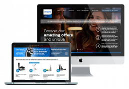
Philips online shop
Philips required a usable eCommerce shop to be rolled out across the UK and Europe. They wanted to increase ROI by converting online window shoppers into paying customers with a revamped online shopping experience. The shop had to be user-friendly, reflect the Philips brand, attractive, and entice shoppers to come back for more.
Discovery
The Problem
Philips existing site was not mobile friendly, had overcomplicated menus, a dysfunctional search bar that returned random unrelated items, and a long and confusing checkout process. The site was also full of UX and UI inconsistencies. The business wanted to create a usable user experience for customers to maximise conversions and keep customers returning.
The site was to be built around the Hybris e-commerce platform which was extremely limited in its ability to be customised from a development point of view. Designs needed to be validated with the Philips product team and Hybris consultants based in Amsterdam to make sure they could be implemented.

Research
The Challenge
Several factors would determine the success of this project. This included user experience, brand recognition, navigation, trustworthiness, product quality, shipping costs, return policies, and customer service.
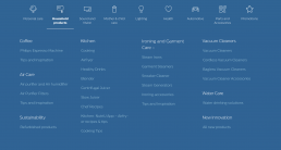
Key navigation design considerations
• Well-defined product categories
• Product search
• Filtering products
• Product quick view
• Promo offers
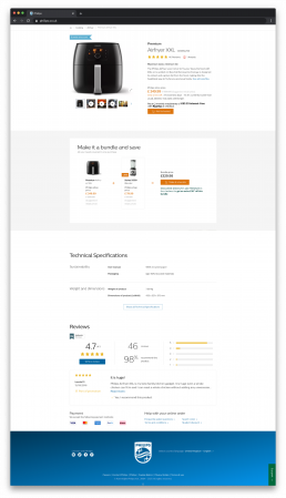
• Great product imagery
• Supplying right amount of product info
• Employ persuasive design
Design
UI challenges
The Philips style guide was limited and was designed around brand print material rather than UI components. There were many standardised components that needed to be designed to reflect the brand. Considerations included atomic components, colour, typography, spacing and layout, logo usage, product imagery, tone of voice etc..
Iterative testing
The site had to be visually appealing, responsive, display multi-lingual content and was constrained by the technical limitations of the e-commerce platform Hybris. This involved a lot of A/B testing and iteration.
Communication and consistency
I led the UI from conception to execution, working in close communication with the UX team in London and stakeholders from the Philips product team based in Amsterdam. I was responsible for designing & implementing a unified, consistent UI experience. The user centred design was tested, iterated and simplified to remove distractions.
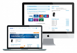
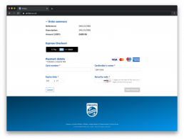
Product search
Search functionality was added to help customers easily find what they are looking for:
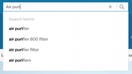
Autocomplete
An autocomplete database function was built to support all kinds of queries, such as product names, categories, attributes, as well as customer service related information.
Search placement
The search box was positioned in the top right of the header navigation following known design patterns.
The search design was discoverable, highly visible, and used autocomplete to aid usability.
Design
Filtering search results
Customers can now refine search results based on certain criteria as well as relevance (best sellers, highest or lowest price, product rating, newest item, etc.)
Design
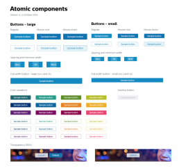
Designing the atomic components
The UI was adapted from Philips existing paper brand guidelines and simplified where possible.
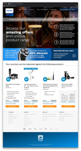
Colour palette and typography
Colour palettes were used to develop brand identities for different product categories. The Centrale Sans Pro typography added strong brand recognition. Product imagery on clean white backgrounds made the products stand-out.
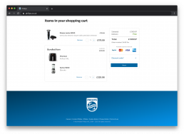
White space and high contrast CTAs
White space was added where possible to let the content breathe and allow clean UI layout do the talking. High contrast call to action buttons helped them standout and maximise conversions.
Evaluate
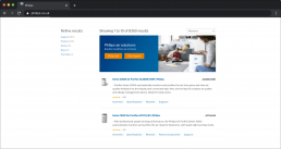
Maximising shopping conversions
CTA button variations were A/B tested. We tested the Philips blue against bright orange. Research showed with orange, customers were 22% more likely to click through and make a purchase which resulted in around a 22% increase in sales. This colour is in high contrast to the main Philips blue branding and logo.
Designed for localisation
Making sure multi-lingual content worked globally.
Laying the ground work for the design system
The work on this project led to an atomic design style guide project that Philips would implement across their portfolio of global sites.